

This is a follow up to my June 7 post Urban Planning After Pandemic (AP) , about predictions for urban planning, specifically 4 Predictions for Urban Planning Post-Coronavirus – Urban Planners Will Become Even More Reliant on City-Level, Granular Data. Kayla Matthews, the author has posted a follow up blog Pandemic Data for Planners . This is a review of this post and cited and other data sources and technologies that assist communities to response to the current virus and future events.
“The right data will be critical in crafting effective responses to the threats posed by the coronavirus.“
Tracking
The pandemic has enhanced the need for timely and accurate data for tracking it’s spread, allowing for targeted deployment of vital medical support support for public health and safety.
An example is Boston’s COVID-19 Case Tracker, displaying city and national data. Further detail is shown by county. Key issues with this kind of dashboard:
1. The need to maintain and expand the data base
2. Ease of access to and understanding of the data
3. Data is not useful when not used, It must be actionable – the basis for intelligent and timely decisions.
An Example
The article goes further expands use of tracking or dashboard data, to include mapping those most vulnerable due to underlying health conditions. A good example is the Urban Health Vulnerable Index. This not only tracks COVID data in urban areas across the country, but also has additional health related layers, such as heart disease, diabetes, and lung disease . The purpose of the Index for use a a tool:
“1. Uncovers which parts of our communities could be most affected by a COVID-19 outbreak.
2. Allows local governments to anticipate where resources may be needed the most.
3. Provides important information about a community’s access to healthcare.“
This clearly demonstrates the power of good and reliable data mapped for use by planners, health providers and policy makers to help and support communities.
Other Examples
During the pandemic, I followed the following sites:
At the national level – COVID-19 Dashboard by the Center for Systems Science and Engineering (CSSE) at Johns Hopkins University. This is similar to the Boston example, and in fact may be based on the Hopkins Dashboard.
For the my state (Maryland), I follow this site, again based on the Hopkins data and platform. Layers are available by county and zip code – Coronavirus Disease 2019 (COVID-19) Outbreak.
Dashboards and transparency
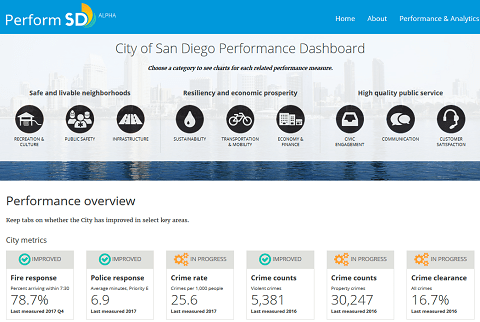
Prior to COVID-19, many communities invested time and money in dashboards to track the progress of adopted policies including the economy, education, demographics, education,, the environment, housing, public safety and health.The pandemic has only heightened the need for this need for this holistic view, impacting all facets of community life.
The dashboards also fill a needed void of open government and transparency, particularly during the current crisis. This will need to be strengthened as communities recover and for the efficient use of limited tax dollars.
An example, Alexandria, Virginia – Performance Dashboard – “Annually, City departments report on how well their department is performing using key indicators. This information, which is used to track and evaluate performance, is jointly developed by individual departments and the Office of Performance and Accountability (OPA).”

So what
The lesson here for me is now more than ever, data- based decision-making is needed, as COVID-19 has demonstrated. This is again, an opportunity to leverage and merge technology and data to benefit our communities. This promotes transparency, the best use of limited resources and funds, while specifically pinpointed where the assistance is needed the most. Finally, a dashboard integrates all aspects of a community, not in isolation, as one elements affects others.
